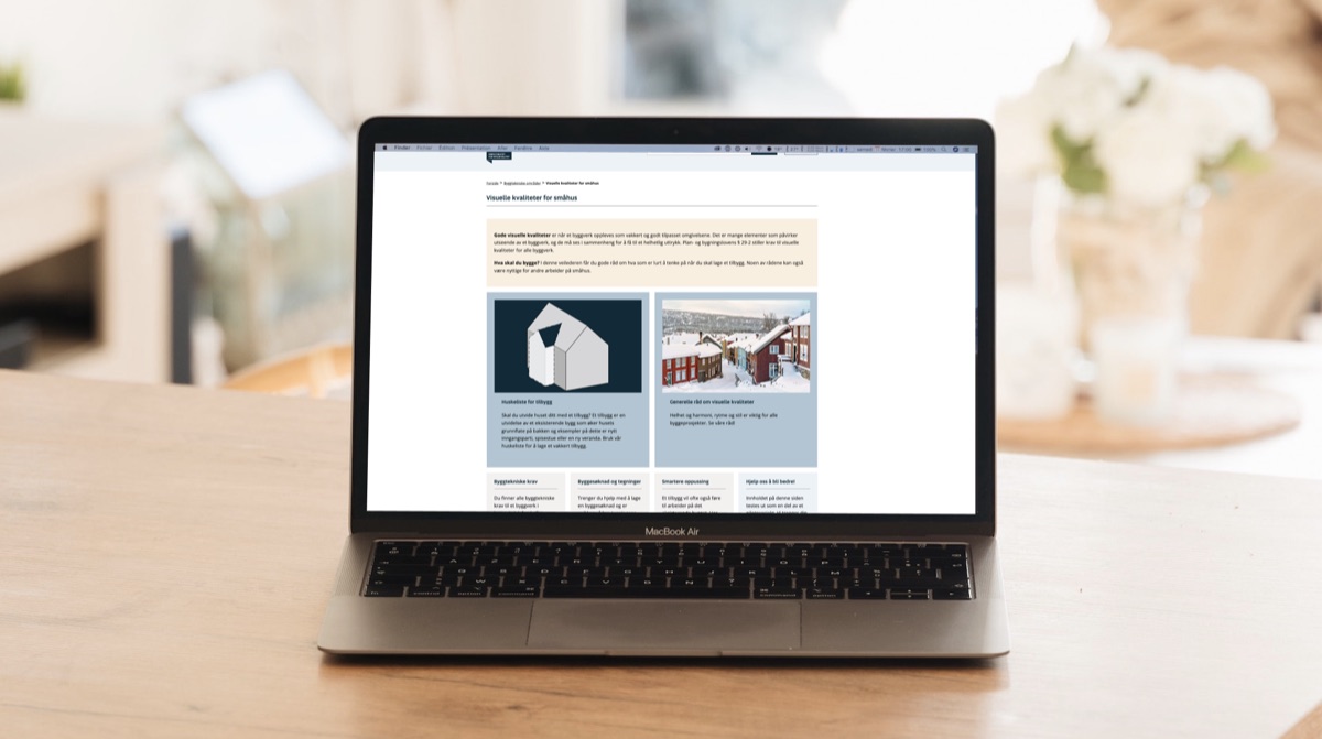
Problem
The Norwegian Building Authority (DiBK) received a steady stream of building applications, many of them wrong. Not because applicants didn't care, but because nobody had told them clearly what was expected.
One requirement caused most of the confusion: aesthetic quality. What does it mean for a building to "adapt to its surroundings"? How do you assess "visual qualities", and how do you write that into an application?
My task was to make the aesthetic requirements understandable for professionals and private individuals alike.
Approach
I gathered insights from architects, homeowners, municipal case officers and legal experts, mapped the user journeys and marked the points where people got stuck. The pattern was consistent: people wanted to get it right and didn't know how.
Two things made it hard. Internally there was skepticism about whether the legislation could be simplified without losing its intent, and about whether the platform could carry a user friendly solution at all. On top of that, "aesthetics" meant different things to different people, colours and materials to some, how a building sits in the landscape to others.
So we narrowed it. We chose private individuals as the primary audience, because their needs are nothing like an architect's: plain language, concrete examples, and help writing the actual text for their application. We also limited the guide to the project types private individuals submit most often, instead of trying to cover every case.
Outcome
After several rounds of testing and iteration with the legal and technical teams, the guide launched as part of DiBK's digital services. Applicants who used to face a legal requirement and a blank field now get plain language, worked examples, and help writing their own description.
The requirement never changed. What changed was that someone finally wrote down what it meant.